Simple things that are hard and important
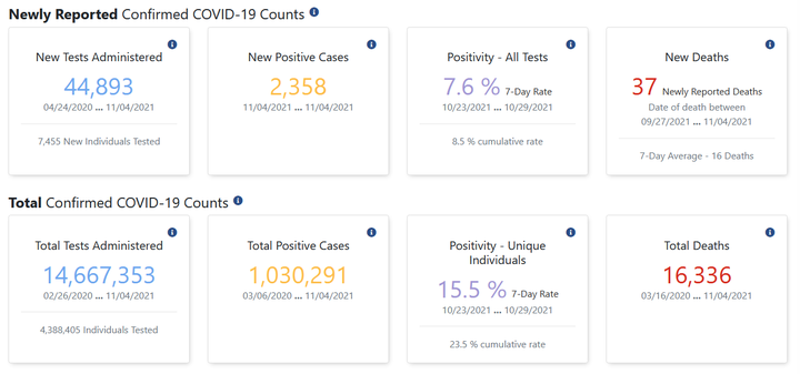 Screenshot from Indiana’s COVID dashboard (taken 2021-11-06)
Back in September, I dusted off a training course that I first developed in 2018 to teach to a class of new hires at work. The content focuses on many types of data disasters1 that are often encountered when working with data – from misunderstanding how data is structured pr how tools are meant to work, to errors in causal interpretation and model building – yet rarely taught in stats training.
This year, however, the material felt a bit different, and it was not simply because (for the second year) I was sitting alone in a room all afternoon rambling to myself and a Zoom screen about all the ways everything can go wrong and how you really can’t ever trust anything (in data, that is.)
Teaching an intro data analysis class tomorrow which means I'll be sitting alone in a room by myself for three hours and talking at my computer screen about how numbers can lie to you. Just another normal, healthy 2020 thing pic.twitter.com/u6nKfLhaxj
--- Emily Riederer (@EmilyRiederer) September 15, 2020
This year, the material took on a whole new level of gravity. As I walked through my taxonomy and examples of data disasters, one of my underlying message had always been that stats education focuses on the “complex” things (e.g. proving asymptotic convergence) but simple things can also be hard and important. However, as the pandemic has evolved over the last two years, more highly important data processing has been done in the open and on the fly than ever before, and much of it has unsurprisingly hit many of the snags one would when working with messy, inconsistent, ever-changing, observational data.
As I walked through the course, I found myself thinking about many pandemic-related examples for every “disasters” which all felt more urgent and timely than the industry-specific examples that I had concocted. In this post, I walk through just one such example of simple things that are hard. This is the story of a simple average informing public health policy in Indiana and what it illustrates about imprecise estimands, metric calculation, sampling variability, and selection bias.
What happened?
A local news article explains that the seven-day test positivity rate was being calculated as the average of daily positivity rates. Instead, the methodology was changed to calculate a single rolling weekly rate:
“The change to the methodology is how we calculate the seven-day positivity rate for counties. In the past, similar to many states, we’ve added each day’s positivity rate for seven days and divided by seven to obtain the week’s positivity rate. Now we will add all of the positive tests for the week and divide by the total tests done that week to determine the week’s positivity rate. This will help to minimize the effect that a high variability in the number of tests done each day can have on the week’s overall positivity, especially for our smaller counties.”
That is, the decision was made to move from avg( n_positive / n_tests ) to sum( n_positive ) / sum(n_tests).
While the article states that the change would not have historically changed any decision-making, this metric nontheless was tied to important decision making processes, thus raising the takes for its accuracy:
The changes could result in real-world differences for Hoosiers, because the state uses a county’s positivity rate as one of the numbers to determine which restrictions that county will face. Those restrictions determine how many people may gather, among other items.
At the outset, this may seem like a trivial change and the type of distinction one might not bother to make when throwing together a quick dashboard or report2 However, as we will examine step-by-step, this subtle mechanical difference actually carries with it a weight of statistical reasoning.
What went wrong?
What is the target?
The first step to tracking a metric is defining the metric to track. This sounds obvious, but too often it is not. Metric design requires a lot of thought3 yet often glossed over even in important contexts such as medical research4. In more complex problems, this will affect the research design and statistical methods we use to derive results, but in simpler cases like this, it can simply alter basic arithmetic.
So, the problem here starts with the very definition of what we are trying to track:
average proportion of positive test results over the past seven days
Now, at first glance, that may seems pretty specific. An average of a proportion with a clear numerator and denominator over a defined time horizon. Easy, right? Not so fast. There’s more nuance than meets the eye in how we calculate averages and what technically “happened” in the last seven days.
Average over what?
At some point in primary school, you were probably taught that you calculate an average by adding up a bunch of numbers and dividing the total by the number of numbers we started with. That’s not wrong, but it’s actually more of a special case than a general rule.
Later on, we might have learned about the weighted average as a separate concept. There, instead of sum(x) / count(x), we might have learned another formula like sum( x * weight(x) ) / sum(weight(x)). Of course, this isn’t so much an extension as an abstraction (where normal arithmetic averages are recreated when the weight is set to 1 for all values of the number in question.)
So, ultimately, all averages are weighted averages whether we acknowledge it or not. That, in turn, suggests that whenever we define a metric as an average, the obligatory next question is “the average over what?”
Going back to the case from Indiana, they were taking “unweighted” arithmetic average of the test positivity proportions instead of the propotion of the average. Put another way, they were taking the average of days instead of the average over tests.
To see the difference, suppose there are 50 tests on day 1 with 20% positive and 100 tests on day 2 with 10% positivity. Averaging over days gives up a value of 15% and over tests a value of 13.3%
(avg_of_days <- (10/50 + 10/100) / 2)
(avg_of_test <- (10 + 10) / (50 + 100))

#> [1] 0.15
#> [1] 0.1333333
Alternatively, none of this matters if the number of tests are the same on both days because then our weights are constant and we are back to the flat arithmetic average over observations (which in this case are days). We can see this if we allow day 1 and day 2 to have a 20% and 10% rate, respectively, but assume 100 tests occured on each day.
(avg_of_days <- (20/100 + 10/100) / 2)
(avg_of_test <- (20 + 10) / (100 + 100))

#> [1] 0.15
#> [1] 0.15
Does sample size cause problems?
So, we probably used the wrong type of average for the question at hand, but we probably could have gotten away with it if the sample sizes across days were not substantially different. Sample size clearly affects the weighting, but what other statistical issues does it cause?
Suppose for a minute, that this is a binomial setup where each test has an equal probability of coming back positive (if you’re thinking “But it does not” – don’t worry, we’re getting there). We can simulate a number of draws from binomial distributions of different sample sizes, compute the sample proportion of successes, and inspect the mean and variance. Below, we confirm what we would expect that small samples produce unbiased but high variance estimates5.
p <- 0.5
n <- 1000
size <- c(10, 100, 500)
samples <- lapply(size, FUN = function(x) rbinom(n, x, p) / x)
vapply(samples, FUN = function(x) round(mean(x), 3), FUN.VALUE = numeric(1))
vapply(samples, FUN = function(x) round(sd(x), 3), FUN.VALUE = numeric(1))

#> [1] 0.498 0.500 0.500
#> [1] 0.157 0.048 0.023
As we would expect, we see the means observed with a sample size of 10, 100, or 500 are roughly the same but smaller sample sizes produce a much wider distribution of values.
So, days with smaller samples are most likely to take the most extreme values which could yank an average in one direction or the other ephemerally6. This alone is a bad situation for a metric of interest; however, despite the higher variance, small sample sizes will not induce bias. That is, we will be correct “on average” and small sample days are no more likely to be extreme in one direction or the other.
Does sample size correlate with a problem? (On domain knowledge and bias)
The vagaries of sample size may not independently be causing this problem, but they do raise a few broader issues. First, “unweighted” arithmetic averages make the most sense when we can invoke statistics’ favorite assumptions of “independent and identically distributed” and seek to use average to remove noise from the data.
However, this is where our domain knowledge of the problem comes to bear. Early in the pandemic, testing was hard to come by and testing delays were massive. Tests were often restricted in settings for those who were severely ill with something and, thus, more likely to be positive (e.g. those showing up at hospitals). It was particularly likely that commercial or government testing sites might tend to be more available on weekdays and less so on the weekends. So, lower-volume test days are likely correlated to days where the true positive rate of the differentially-selected population being tested was higher.
In this environment, daily test rates are not identical and independently distributed. Instead, high test rates are positively correlated with low-volume test days, and low volume test days are too heavily weighted in day-averaged test positivity metrics.
What went right?
It’s never easy to say you’re wrong, and if you particularly dislike admitting to being wrong, working in data will be rather painful. You will be wrong quite frequently. If you don’t like being wrong, you can probably also appreciate how significantly not fun it must be to hold a press conference or write a press release about being wrong. However, the best way to be right is to never stop questioning your own methods or looking for ways to change or impprove.
-
Similar to the long-form writing project I’m working in the open over here ↩︎
-
In fact, I suspect there is a side story here about some common BI tools making the computation of the former metric significantly easier than the latter. But, that is not something I can substantiate, so I will not get on that soapbox. ↩︎
-
One framework for approaching metric design is eloquently explored by Sean Taylor in this essay: https://medium.com/@seanjtaylor/designing-and-evaluating-metrics-5902ad6873bf ↩︎
-
This new study cites many examples of poorly defined estimands (think metrics) from the BMJ: https://trialsjournal.biomedcentral.com/articles/10.1186/s13063-021-05644-4 ↩︎
-
We also know this with standard statistical results and formulas, but it’s more fun to see it. ↩︎
-
As discussed at length in this Scientific American article: https://www.americanscientist.org/article/the-most-dangerous-equation ↩︎